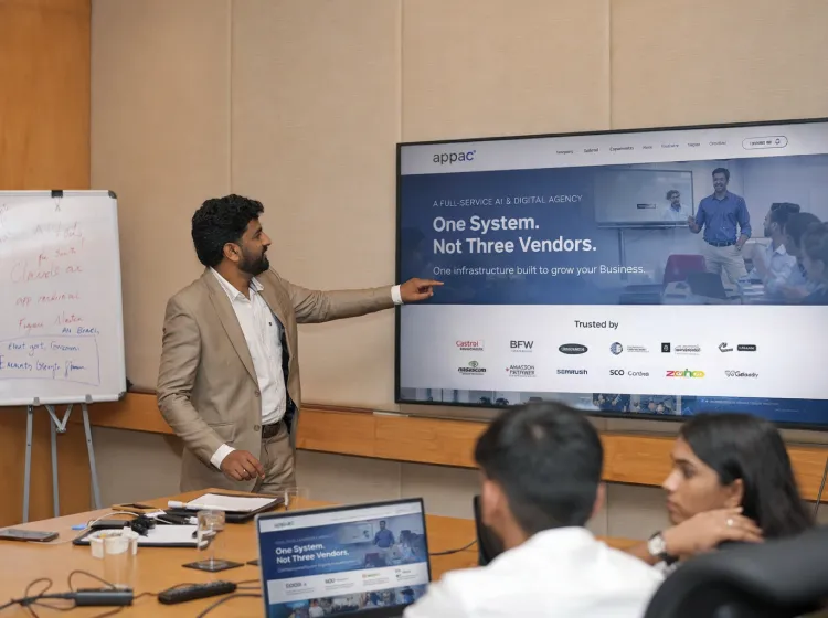
A Full-Service AI & Digital Agency
Four Disciplines. One Integrated System
Building Digital & AI Infrastructure for B2B Brands
Trusted by


Over Two decades in Manufacturing, Healthcare, and B2B brands end-to-end. We speak your buyer's language because we've spent decades in their World.
We Don't Just Work with Industries
We Step into their World
Numbers don’t pitch. They prove.
2000+
Projects
delivered
150+
Active
Clients
90%
Client
Retention
20+
Years of
Experience
Certified by


Member of


Why do Customers prefer us?
Fully Integrated Under One Roof
Every discipline shares data, strategy, and accountability. No finger-pointing between vendors. One P&L for your entire digital growth.
20+ Years of Systems Thinking
Not a startup learning on your budget. Two decades of pattern recognition across manufacturing, healthcare, engineering, and more.
Measurable From Day One
Attribution and analytics built into infrastructure from the start not retrofitted after campaigns fail to justify themselves.
ISO-Certified, Enterprise-Grade Process
ISO 9001:2015 and ISO 27001:2022 Certified. Google & Meta Business Partner, NASSCOM & CII member.
AI Visibility & Citation Architecture
AI-first architecture embedded from day one - AEO and GEO are not add-ons. Schema markup, structured FAQ, and NLP-friendly content built to increase brand citations AI engines
100% In-House Production
No subcontracting. 30+ team members across marketing, design, technology, and Al all under one roof.
Industries We Serve
We don't work in Industries. We step into their World.

Manufacturing

General Engineering

Healthcare

Real Estate
What we bring to every vertical?
Domain Knowledge First
20+ years of experience in Manufacturing, Healthcare, and B2B - end to end. We speak your buyer's language because we've spent decades in their World.
No Generic Playbooks
B2B buyers have long sales cycles, multiple decision-makers, and high-value contracts. Our strategies are calibrated for this reality.
Content That Converts
Your buyers are assessing risk and opportunity. We create content that addresses both - moving prospects from awareness to pipeline.
End-to-End Accountability
From brand awareness to qualified leads, we own the full funnel. One team, one strategy, one outcome.
Four Disciplines, One System
Expertise in working across manufacturing, healthcare, real estate, and technology has given us something no tool can replicate: pattern recognition at scale.
MARKETING
Expert branding. Tailored to your vision.
We believe creativity is only possible when employees feel safe and supported.
TECHNOLOGY
Digital Presence with stunning Website Designs
We build digital experiences that engage and convert
AI & INTELLIGENCE
Grow your Digital Future with Strategies!
Adaptive AI solutions
DESIGN
Expert branding. Tailored to your vision.
Creative solutions for your brand identity
DIGITAL MARKETING
Database architects for your Business
Data-driven marketing strategies

Case Studies
Expertise in working across manufacturing, healthcare, real estate, and technology has given us something no tool can replicate: pattern recognition at scale.
Corporate Website and Digital Marketing
Accelerating the Customer Journey with Strategic Digital Marketing and AI-Driven Results.

Bharat Fritz Werner Ltd
Booking Engine and Brand Marketing
Web Development, Application Development and Social Media Improving brand recall to help improve sales by over 75%

RedTaxi
Hospital Portal and Digital Marketing
Using a comprehensive digital marketing strategy, we significantly increased their online visibility, leveraging both organic and paid methods.

GKNM Hospital
Why Industry Leaders Choose Appac
Nine out of ten clients stay with us year after year. That is not a marketing claim, it is the result of a simple principle: we care about your business the way you do. Here is what that means in practice.
Out of 10 Clients, We Retain 9
20+ years in Manufacturing, Healthcare, and B2B end to end.
Strategies calibrated for long sales cycles, multiple decision-makers.
Addressing risk and opportunity moving prospects from awareness to pipeline.
From brand awareness to qualified leads, we own the full funnel.
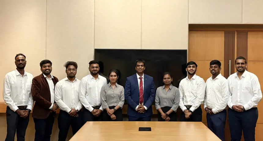
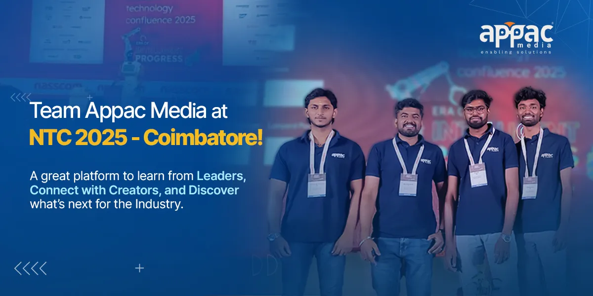
News and Events
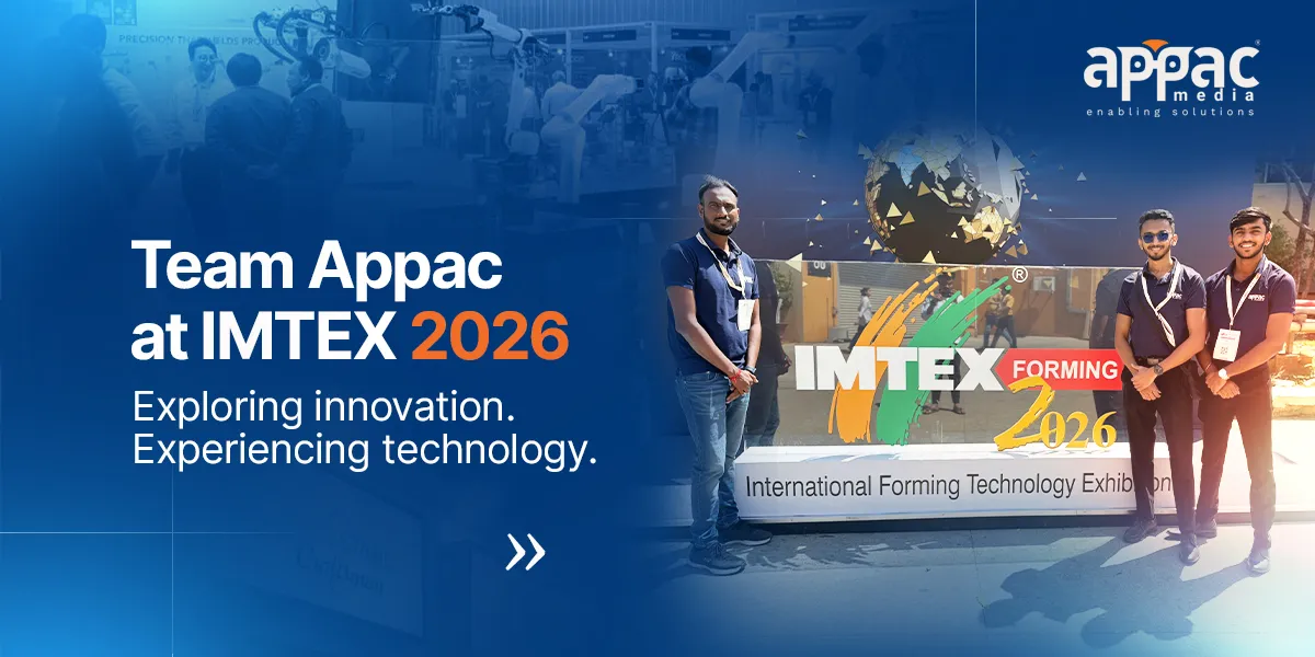
28
Jan
Team Appac at IMTEX 2026
From machines to meaningful conversations - IMTEX was a spark for Team Appac!
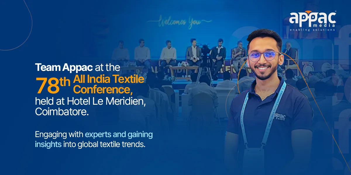
22
Nov
The 78th All India Textile Conference 2025
The 78th All India Textile Conference was held on 21st & 22nd November 2025 at Hotel Le Meridien, Coimbatore.
Technology and Partnership
We have partnered with top technology leaders to make sure your business gets the most from the best tools available today.


Q
Tell us how can we assist you?
We are always happy to answer any questions!
- General Enquiry: +91 93429 02804
- Sales Enquiry: +91 93429 02803
- Landline: +91 422 435 4854
- Whatsapp: +91 93429 02803